
Whether you’re designing sites for clients or managing your own WordPress website, it’s important to know how it looks and works on a mobile device before you make any changes public.
You probably have a mobile phone you can check your site with. But if you’re working on your laptop or desktop, it’s inconvenient to have to keep going back to your phone.
And even if your website looks ok on your phone, there are a lot of phones and tablets out there. Just because it looks ok to you, doesn’t necessarily mean it will work perfectly on every different screen size, browser, and operating system.
So how exactly do you preview WordPress sites on mobile devices? In this guide, we’ll cover a few easy methods of testing your site for mobile without leaving your computer.
Why is it So Important to Test the Mobile Version of Your Site?
Mobile devices overtook desktop computers as the primary method of browsing the web a few years back. Mobile devices accounted for 54.8% of global web traffic in the first quarter of 2021, and mobile phones and tablets took 57.37% of the market share worldwide over the last year.
In some global regions, mobile use overshadows desktop use by a much bigger margin. For example, in India, mobile has over 77% market share.
In response to growing mobile internet use, Google has started to penalize sites that don’t provide a good user experience on mobile.
There have been a number of algorithm updates over the last few years designed to make the search experience better for mobile users. The 2015 “Mobilegeddon” update was the most drastic, as Google shifted to a mobile-first model.
As a WordPress user, choosing a mobile responsive theme is the first step to making sure your site looks good and works well on mobile.
But with the block editor, users have more control over the formatting of individual pages than previously. So it’s important to check how your site looks on a mobile device every time you add new content, even if you’re not developing themes or plugins.
This is especially important if you’re using a visual drag and drop page builder like Divi or Elementor to create new page layouts or add content to your site.
- Method 1: Using the Built-in WordPress Mobile Preview
- Method 2: Using Developer View in Chrome
- Method 3: Using a Third-Party Device Simulator or Testing Service
Method 1: Using the Built-in WordPress Mobile Preview
You’ve always been able to preview your WordPress posts and pages before you publish them. But did you notice that you can also preview how your site looks on mobile?
There are two places you can access a mobile preview in WordPress:
- From the post and page editor (not always accurate)
- From the WordPress customizer
WordPress Post/Page Editor Preview
Let’s first take a look at how the mobile preview in the Post and Page editor works. Click the “Preview” button that’s next to the “Publish” or “Update” button.
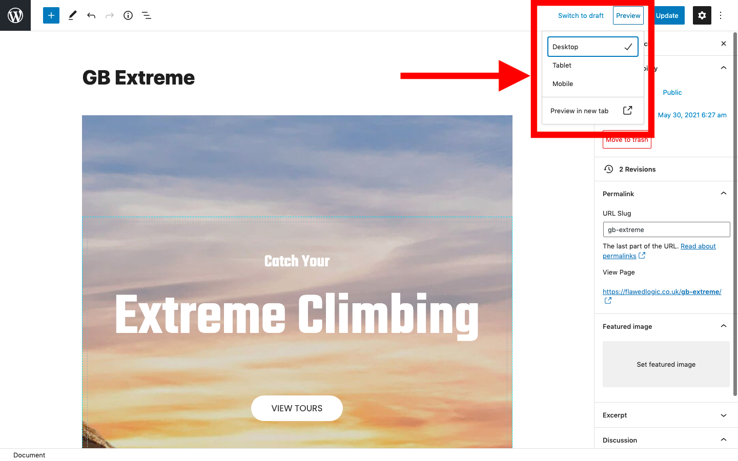
In the drop-down menu that pops up, select “Tablet” or “Mobile” before clicking.
This will immediately adjust the size of the page editor. However, this is a very rough and ready estimation of how your content will look and may not be very accurate, particularly if you’re using custom blocks or externally loaded CSS.
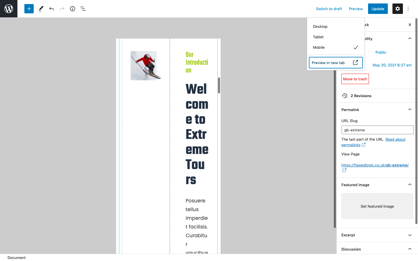
You can see in this example that the editor has simply resized the blocks to fit into a smaller screen and wrapped the text.
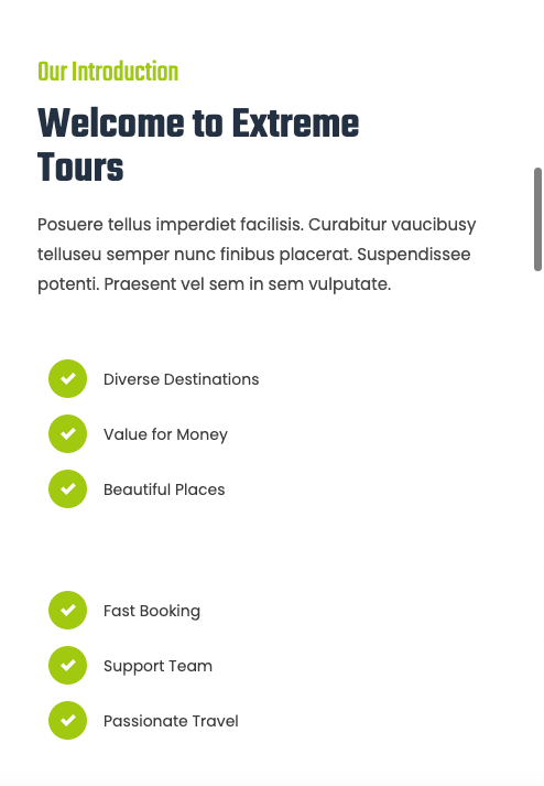
However, if you look at the live site at a smaller screen size, you’ll realize that it doesn’t look like this at all. Instead, the responsive design settings have kicked in to rearrange the blocks and resize the text.
Here’s how it actually looks on a smaller browser screen:
Lesson: don’t trust the mobile preview in the Post and Page editor. To be fair, this is a pretty new feature and has only been around since WordPress 5.5, which was released in mid-2020. Hopefully, the mobile page preview will be improved in the future.
WordPress Customizer Preview
So is the preview in the WordPress Customizer any better? Let’s take a look.
To access the WordPress mobile preview, go to Appearance > Customize in your WordPress dashboard.
This will display a preview of how your site looks and allow you to see how changes you make to the style change its appearance in real-time. You can navigate to any page on your site and scroll up and down just as if it’s the live version of the site.
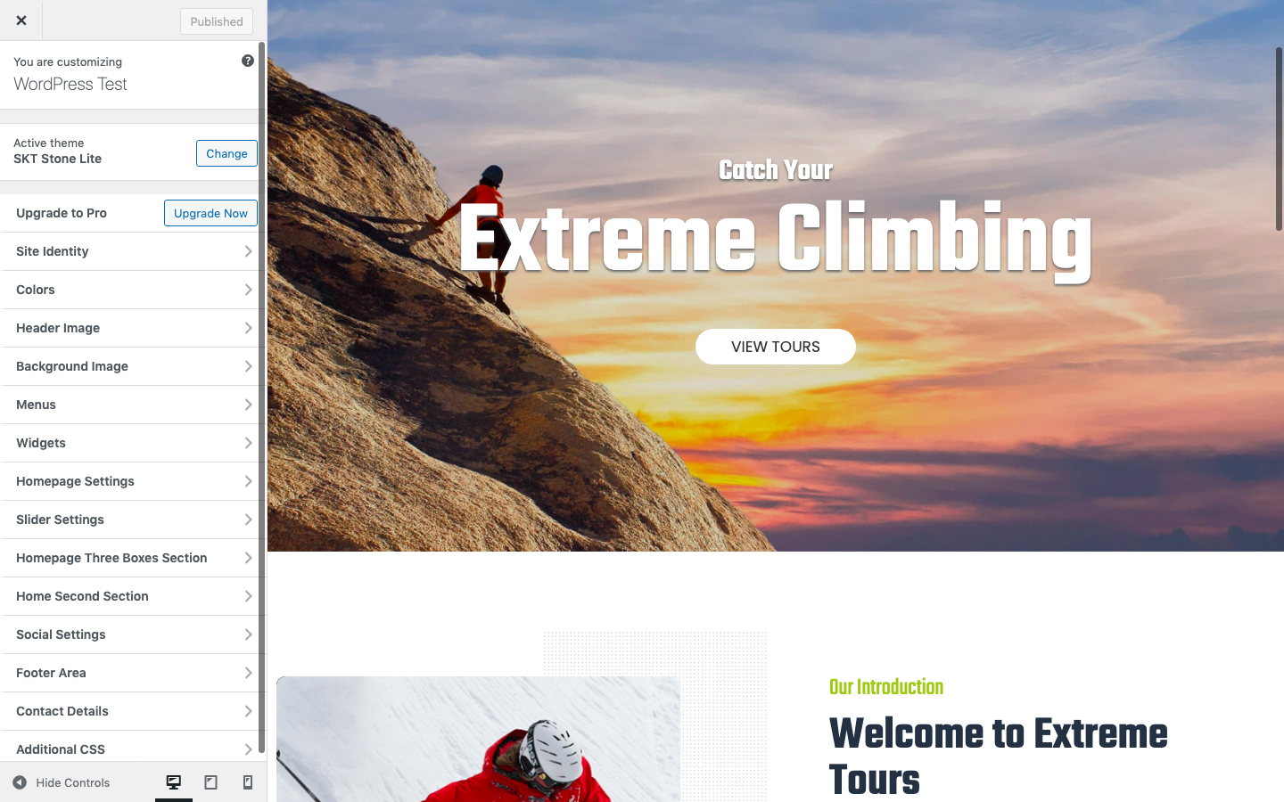
To see how your site will look on a different screen size, use the icons at the bottom of the customization menu to switch between device views.
The default is desktop, with tablet in the middle and smart phone on the right.
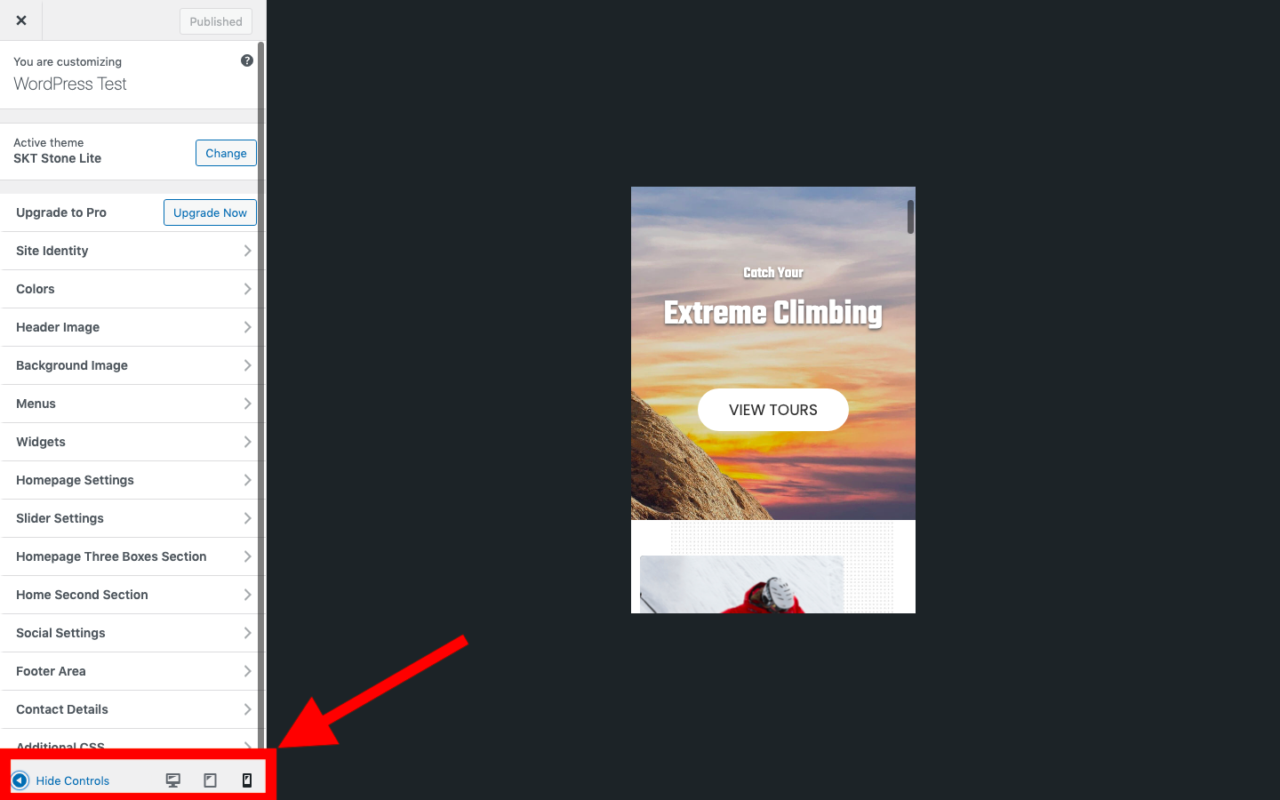
This is the easiest and quickest way to see the mobile version of your site as it’s within the WordPress dashboard and accessible in a couple of clicks
However, this essentially just gives you the same view as you would get by resizing your browser window. It doesn’t replicate exactly how your website will display and behave on every mobile device.
It also only allows you to view your site at three different screen widths. Mobile devices come with many different screen sizes and resolutions.
As the original proposal for the feature by the WordPress core development team states, “Only three options are available by default, and they’re intentionally ambiguous. Rather than looking like specific devices, the intent is to understand what a site may look like on a roughly tablet-sized, portrait-orientation device or a roughly phone-sized device.”
Additionally, the WordPress customizer is only available for themes that support it. This means if you’re using a theme that doesn’t work with the customizer, you won’t be able to use this method to preview your site on mobile.
Viewing Mobile Preview in WordPress Page Builders
If you’re using a visual page builder like Divi, Elementor, Visual Composer, etc. most of them come with their own tools for previewing the mobile version of your site and seeing how the responsive design looks at different screen sizes.
Refer to the user guides of the builder you’re using to find out exactly how to edit and preview your WordPress site for mobile devices.
Method 2: Using Developer View in Chrome
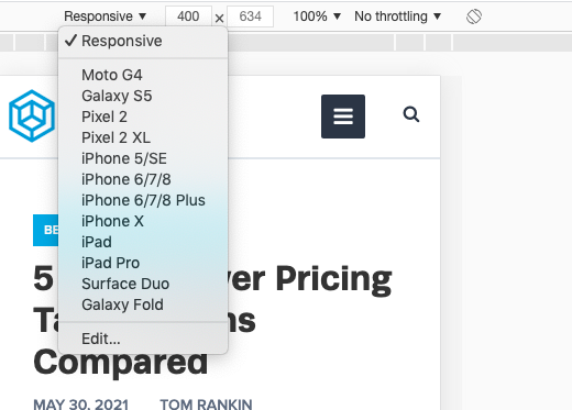
Some browsers have built-in device simulators. Chrome is one of the most popular browsers and you can use it to preview how your site looks on several different devices and at different resolutions.
The Chrome device view is much more advanced than the WordPress mobile preview. As well as being able to switch between popular devices, you can also see how your site looks when you zoom or rotate the screen, and even emulate a throttled mobile internet connection.
However, while this gives you more preview options than using the built-in WordPress mobile preview, it’s still only an approximation of how your site will look.
Importantly, you’ll only be able to get an idea of how your site looks in Chrome. Many mobile devices use different browsers and testing in Chrome only may not be sufficient.
But this is a pretty quick and easy way of testing how your website looks and works at different sizes and it can alert you to any major issues.
To use Chrome in “Device Mode”, go to View > Developer > Developer Tools in the menu.
This will split your browser screen into two with your website on one side and a code and element inspector on the other.
Click the small icon at the top of the developer tools that looks like a mobile phone and tablet. This will resize the screen of your browser view so you can see how your site looks at a lower resolution.
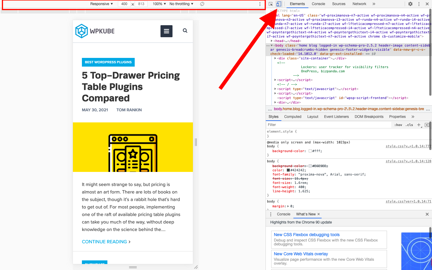
It will also add an additional tool bar to the top of your browser view. You can use this to change the device that it’s simulating, manually set the screen resolution, adjust the zoom, change the rotation of the device, and set the level of throttling to see how the page loading time is affected.
Method 3: Using a Third-Party Device Simulator or Testing Service
It’s important for WordPress developers to test the websites, themes, and plugins they develop thoroughly. For this kind of testing, using a device emulator or simulator is essential.
An emulator replicates both the hardware and software of a device, while a simulator just simulates the operating system and user interface.
Setting up and running an emulator can be complicated and they tend to run slowly. Luckily, they’re used mainly for testing apps and gaming and they’re not necessary for website testing.
Previously, you had to install emulator software on your computer to run tests. Now it’s much easier, as there are several services that run online in the cloud.
This means you can test your WordPress site on pretty much any device you want, running any browser.
Some services you can try include:
- MobileMoxie – Enables you to test both your website and mobile search results on over 50 mobile phones. You can use the service for free on a limited basis or sign up for $29 a month for unlimited live testing.
- LambdaTest – A cloud-based testing platform with site previews on thousands of browsers and operating systems across multiple devices with tools for real-time debugging. The free plan includes 60 minutes of testing a month, and paid plans start from $15 a month.
- BrowserStack – This is not actually a simulator, but a service that allows you to test your website on over 2,000 browsers and real devices on a cloud infrastructure. The service costs $39 a month, but there is a free trial.
Auditing and Testing Your Site to Make Sure it’s Optimized for Mobile
Any of the above methods will let you see how your site looks on a mobile device. However, you might want to run a few more tests to see if there are any other improvements you can make for mobile users.
The Google Mobile-Friendly Test
This simple online tool will allow you to enter any URL and let you know if it considers it to be “mobile-friendly” or not.
To use the tool, just go to https://search.google.com/test/mobile-friendly and enter the URL of the page on your site you want to test.
With any luck, you’ll get a response that looks something like this:
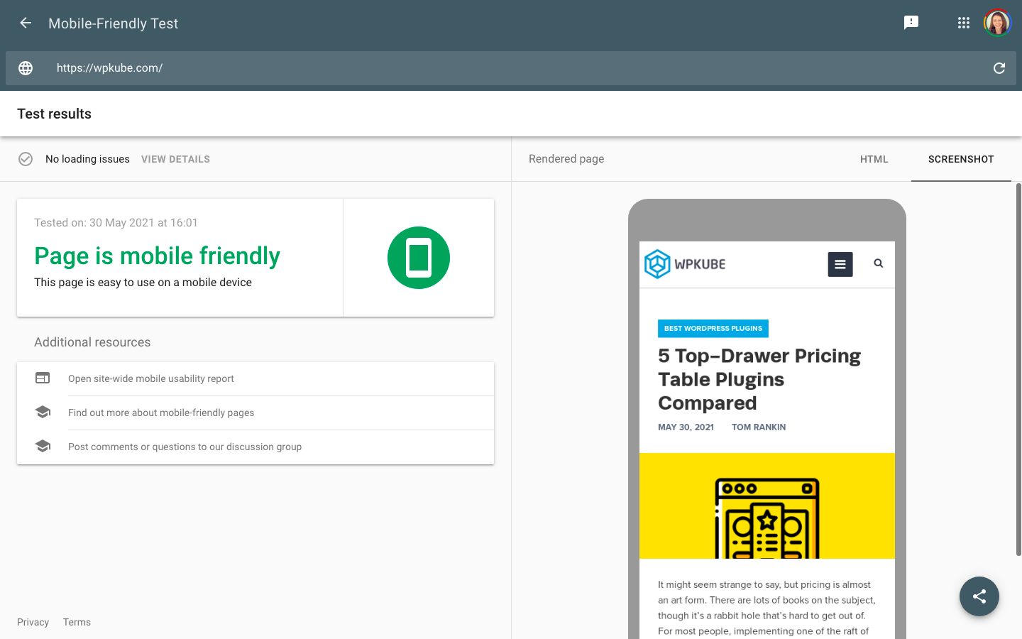
As you can see, this also gives you a handy preview of how your site looks on a mobile device. Although this is just a screenshot, it can alert you if there are any major problems.
If there are any loading issues or problems, you can see full details and recommendations of how to improve your page.
Note: the green “Page is mobile-friendly” does not mean you’ve been given the seal of approval from Google and your site is totally mobile optimized. It just reassures you that there aren’t any major issues that mean it’s illegible or unusable for mobile users.
Google PageSpeed Insights
PageSpeed Insights is another free tool from Google that will give you a score out of 100 based on how optimized your site is for speed.
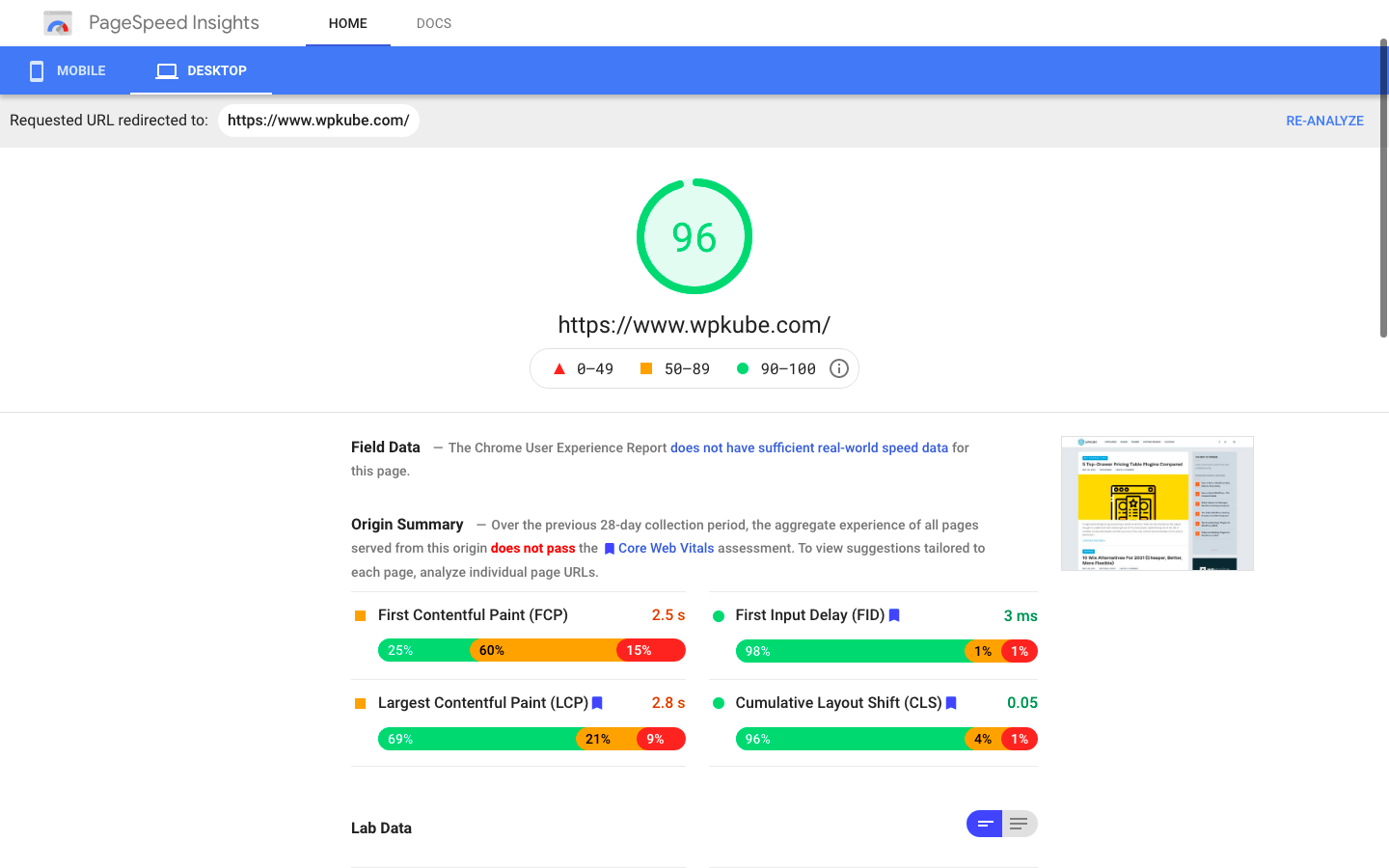
You can switch between mobile and desktop (you’ll get a score for each) and the tool will give you a list of things you can do to speed up your site along with an estimated time saving for each.
MobiReady
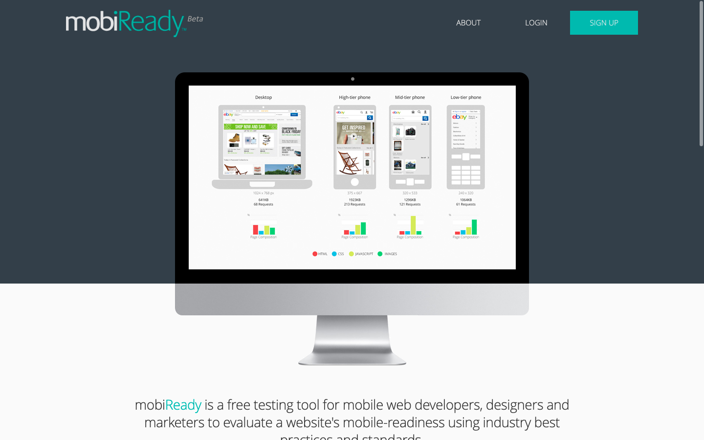
MobiReady is a free tool that will run mobile readiness tests on your website and give you a report of how well it’s performing.
You can benchmark your site against your competitors, and also get analysis and recommendations of steps you can take to improve your site for mobile users.
How to Make Your WordPress Site Mobile Friendly
If you’re using WordPress, you should have a head start on having a mobile-friendly site. WordPress has had built-in tools for ensuring your site works well on mobile for years.
Even so, there are a few steps you should take to make sure that your WordPress site delivers a great experience to users on a mobile device.
1. Use a Responsive WordPress Theme
If you’re using a modern theme that’s updated regularly, you’re probably fine here.
However, if you’re using a theme that’s a few years old, you should check that it’s built to be mobile-responsive.
If your website doesn’t reformat itself to be easier to read at a smaller size, check you’re using the most up-to-date version of WordPress core and your theme.
If updating doesn’t help, you should consider switching to a more modern, mobile-friendly WordPress theme.
2. Make Sure Your Plugins are Responsive Too
Most plugins won’t affect how your site appears on mobile. But if they add any visual elements to your site, you need to check that they work properly on a small screen size.
Again, modern plugins should be designed to work just as well on mobile devices as they do at high resolution. But it’s definitely something you should check before you launch your site.
For plugins, functionality is particularly important. For example, if they add a form or widget to your site, make sure it’s easy to navigate and use on mobile.
3. Disable Pop-ups on Mobile Devices
Pop-ups can be a pain for users on a desktop or laptop machine, but they can make your site totally unusable for mobile users.
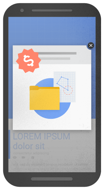
Rather than triggering a pop-up that fills the entire screen, it’s best to disable them entirely for mobile users.
Google has actually started penalizing sites for having intrusive pop-ups that obscure the underlying content. So it’s best to avoid them entirely. Or switch to a banner that takes up only a small amount of screen space.
4. Make sure Images and Videos Scale Properly and Can Be Resized
Media and media galleries can be particularly tricky to display on small screen sizes. Make sure media elements are visible when they’re scaled, or consider disabling them if they’re not necessary and don’t look good on mobile.
For video and image galleries, make sure you’re using a gallery plugin that has considered mobile experience. For example, users should be able to swipe through image galleries.
If images or videos are scaled-down, make it easy for users to view them at a larger size. Most mobile users will want to watch videos in particular at full-screen size.
5. Optimize Site Speed and Performance
Making sure your site loads fast is always important. But page loading time is particularly critical to provide a good user experience to mobile users.
Mobile users are often on the go and want quick access to information. A Google study from a few years back found that 53% of mobile users will abandon a page if it doesn’t load within 3 seconds. And users are becoming more impatient every year as internet speeds and technology continue to improve.
However, the average web page takes 87.84% longer to load on a mobile device.
There are lots of things you can do to speed up your WordPress site in general and on mobile. You’ll get the most gains from:
Final Thoughts
You can use any of these methods to test how your WordPress site looks on mobile but none of them will accurately replicate the real experience.
Make sure you check your site on at least one real smartphone before launching a new site or making any major changes.
If you’ve already taken advantage of some of the preview methods above, it should look ok. So just ensure you can navigate around the site (make sure to check buttons and touchable areas), all the menus are displaying correctly, and any forms or interactive widgets are working properly.
You can then launch your site with the confidence that you’ve done all you can to ensure a great user experience for both desktop and mobile users.


Leave a Reply